IFHOHYP
A decade of content, still easy to find
IFHOHYP is the International Federation of Hard of Hearing Young People, a global federation run by and for hard of hearing people aged 18 to 35. They needed a site that put their current programme first without throwing away years of older work, so I designed and built a custom WordPress site around a filterable archive, with accessibility designed in rather than added afterwards.
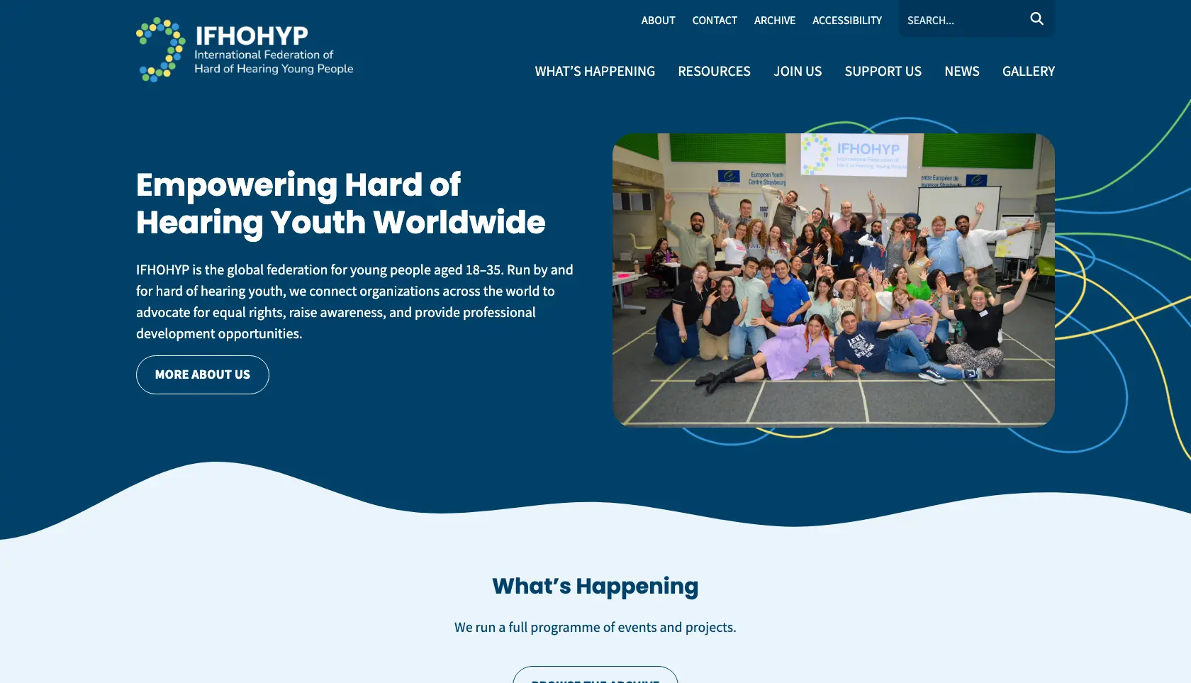
Years of work, and nowhere to keep it
The federation has been publishing for a long time, and a lot of it is genuinely worth keeping: member newsletters, illustrated comics, interviews with hard of hearing people around the world, research and reports going back years. None of it deserved to be deleted.
The trouble is that it was all sitting in the same place as the current programme. Someone arriving to find out about this year's events had to wade through a decade of everything else. They needed a way to keep all of it without it crowding out what is happening now.
An archive they run themselves
A separate, filterable section of the site that holds everything worth keeping, and that the team can fill themselves without coming back to me.
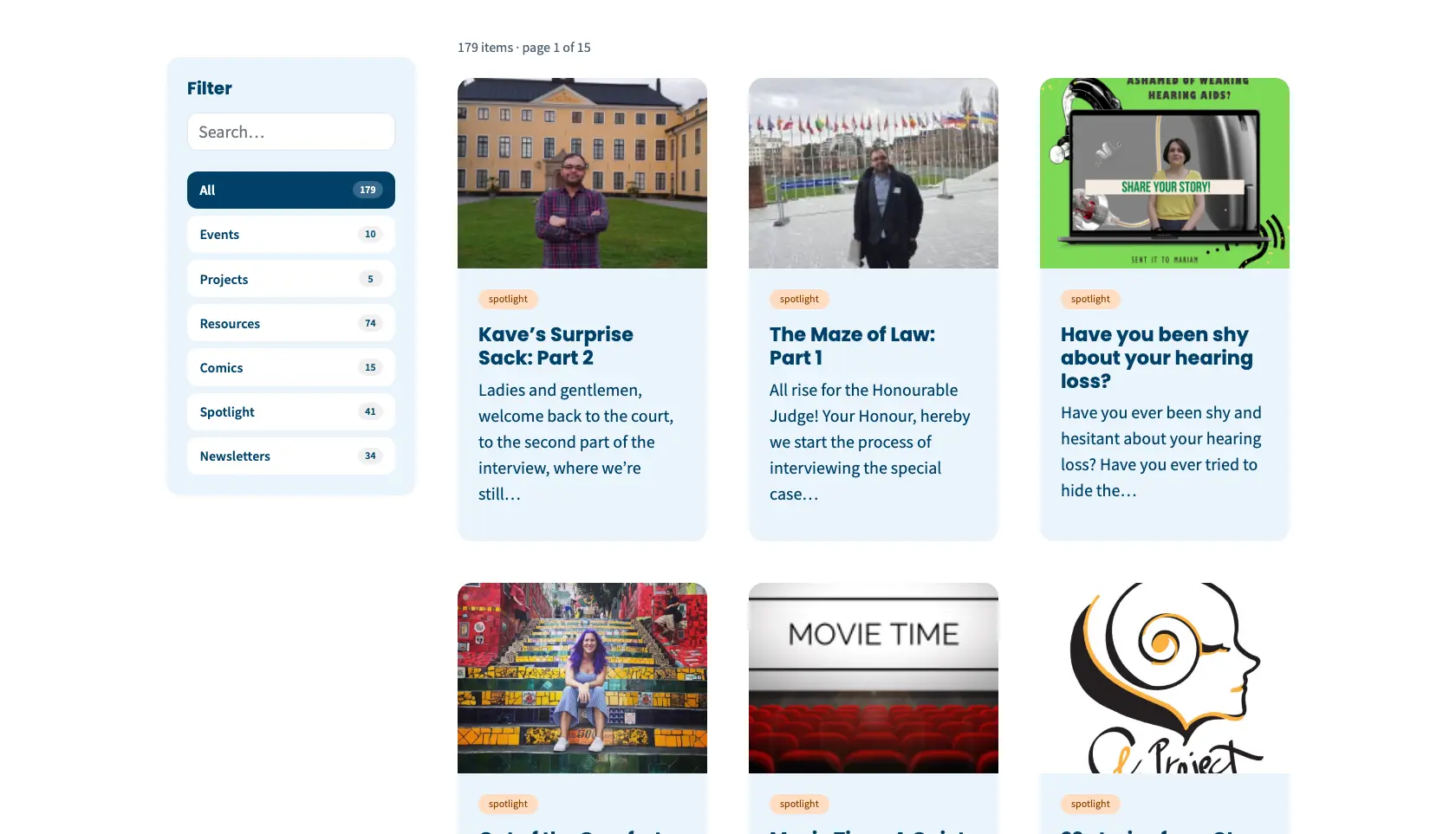
Filter by type
Events, projects, resources, comics, spotlight and newsletters, each with a live count, plus a search box for when you only half remember what you are after. 179 items narrowed down in a click.
Archived in one step
Rather than copying posts between sites, an editor reassigns an item as archived. It leaves the main site, appears in the archive under the right filter, and keeps its original address. Nothing is deleted, and nobody needs to ask a developer.
Built for the people who use it
This is a site by and for hard of hearing young people, and some of its audience uses assistive technology. Accessibility was never going to be a box to tick at the end, so I built to WCAG 2.2 AA as I went rather than auditing it afterwards.
Keyboard and screen reader
A clearly organised page, a shortcut that jumps straight to the main content, and filters that work the same way whether you use a mouse, a keyboard or a screen reader.
Readable by design
Colour contrast checked against AA, generous type, clear focus styles, and headings that describe the page rather than just looking like headings.
Content that stays accessible
Alternative text throughout, and an editing setup that makes it straightforward for the team to keep new content to the same standard.
The same filters for the resources library
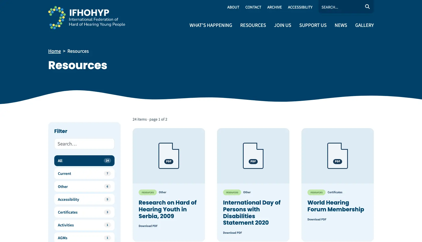
The same filtering that powers the archive also runs the resources library, so downloads are grouped by what they actually are: accessibility guidance, certificates, AGM papers and the rest.
Building it once and reusing it keeps the site consistent for visitors and predictable for the people maintaining it. It also means a new section later on does not need a new piece of bespoke work to go with it.
Where they are now
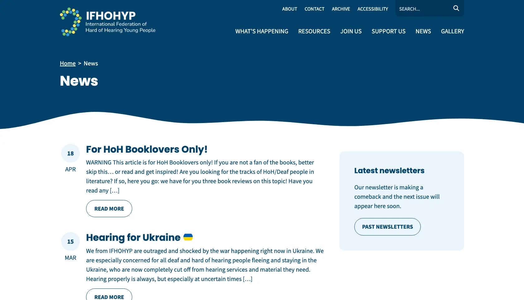
IFHOHYP now has a site that puts the current programme front and centre, while a decade of work sits safely in an archive that people can actually search. The team can move content across themselves as it ages, so the site should stay tidy without anyone having to tidy it.
Jo did a great job with our website for IFHOHYP. She went above and beyond our expectations of that website plan. We're very thankful to Jo for achieving our vision for our new website! Highly recommend!
Got a site with a lot of history behind it?
If you need a site designed around the people using it, and somewhere sensible to put the content you are not ready to lose, I would be glad to talk it through.