County Print Finishers
An accessible site for a business built on inclusion
County Print Finishers has been printing in Oxford since 1946, and they're not a typical print firm: they employ people who need support in the workplace beyond reasonable adjustments, working with the DWP as a supported business whose line is "we see the person, not the disability". For a business like that an accessible website isn't a nice extra, so when they asked me to rebuild the site, accessibility and clarity were the two things that mattered most.
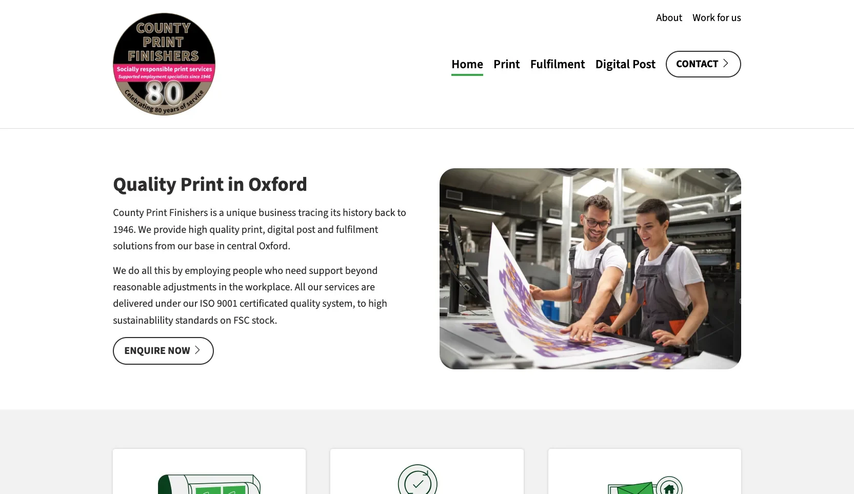
Three services that blurred together
County Print do three quite different things: commercial print, fulfilment, and digital post. The trouble was that visitors couldn't tell. The services blurred into one another, and people arriving with a job in mind had to work out for themselves whether it was something the team could handle.
There was a second, bigger point. Their customers include the NHS, Oxfordshire County Council and other public sector bodies, all of whom have accessibility duties of their own. And given what County Print stand for, a site that shut people out would have been an awkward contradiction. It needed to work for everyone.
Three services, three clear routes
The rebuild is deliberately minimal. Print, Fulfilment and Digital Post each get their own space in the navigation and their own card on the home page, so within a few seconds of landing you can see the three things County Print do and go straight to the one you came for.
Everything else got stripped back to support that. Plain language, short paragraphs, generous spacing, and one obvious next step on every page. Simplifying the words was part of the accessibility work, not separate from it.
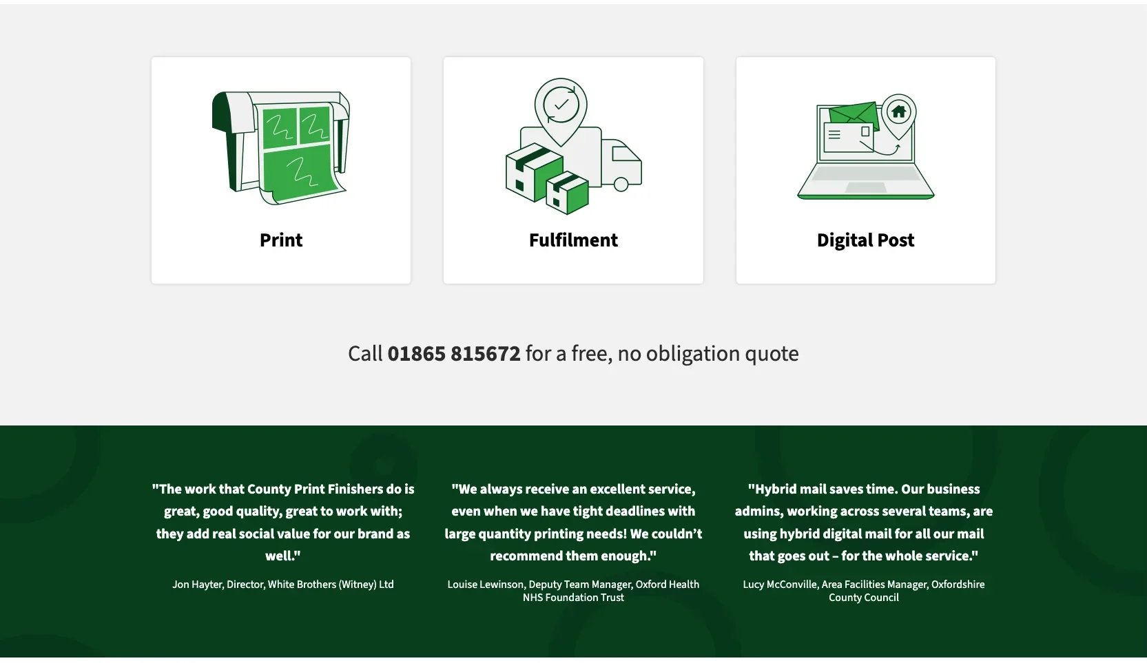
Illustrations instead of stock photos
A minimalist design lives or dies on the few visual elements you keep, and stock photography would have undercut it. So I brought in a freelance illustrator to create three custom graphics, one for each service.
They do a practical job as well as a decorative one. Print, fulfilment and digital post are abstract ideas, and a small clear picture of each helps people recognise what they're looking at before they've read a word. It also means the site looks like County Print and nobody else.
Accessibility, built in from the start
Accessibility was in the brief from day one, so it shaped the design rather than getting retrofitted at the end. Some of what that meant in practice:
Keyboard first
The site can be navigated without a mouse, with visible focus outlines so you always know where you are on the page.
Zoom to 300%
Text scales up to 300% without spilling off the screen or losing content behind other elements.
Screen reader friendly
Clear headings, page sections and labels, so screen readers such as JAWS, NVDA and VoiceOver can make sense of every page.
Honest links
Links are underlined rather than colour-coded alone, and anything opening in a new tab says so.
Reduced motion
If a visitor has asked their device to reduce motion, the site respects that and holds still.
Usable forms
Clear labels and visible field boundaries, so nobody has to guess where to type or what's being asked.
An honest accessibility statement
County Print publish an accessibility statement, and it's a candid one. It records the site as partially compliant with WCAG 2.2 AA, and it lists what still falls short rather than glossing over it: the virtual tour has no written description, and the embedded Google map limits how far it can be magnified. Both are third-party pieces where the controls sit outside our hands.
I'd rather that than a statement claiming perfection. It tells visitors exactly what to expect, gives them a phone number and email if something blocks them, and leaves a clear list of what to tackle next.
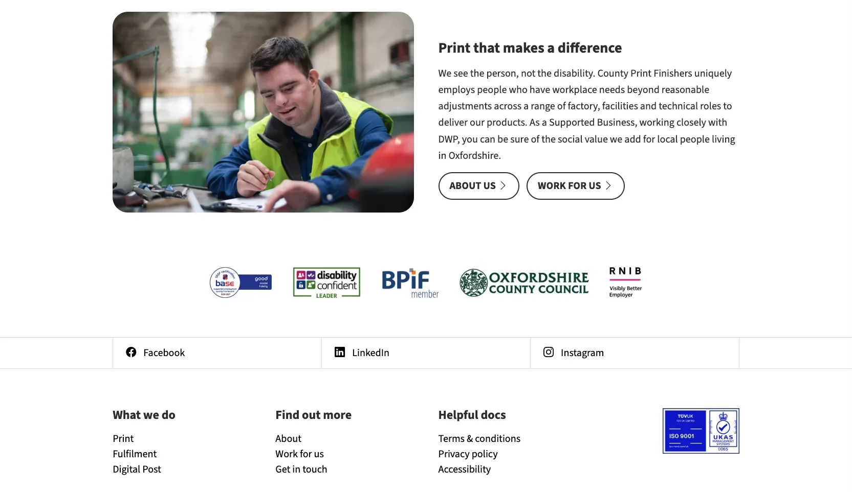
A site that says plainly what they do
County Print Finishers now have a site that says plainly what they do, gives each of their three services room to breathe, and works for visitors whether they're using a mouse, a keyboard, a screen reader or a magnified screen. The commissioned illustrations keep the minimalist design feeling considered rather than sparse.
Need a site that works for everyone?
If accessibility matters for your organisation, whether that's a legal duty or simply the right thing to do, I can build it in from the start. I'd be glad to talk it through.