Centre of the Cell
A science centre that has to be five sites at once
Centre of the Cell is a science education centre at Queen Mary University of London, and its website has an unusual amount of work to do: school bookings, home education, family visits, a youth scheme, venue hire and an online shop, all under one roof and one brand. I built it as a custom WordPress theme with WooCommerce underneath, and I still look after it.
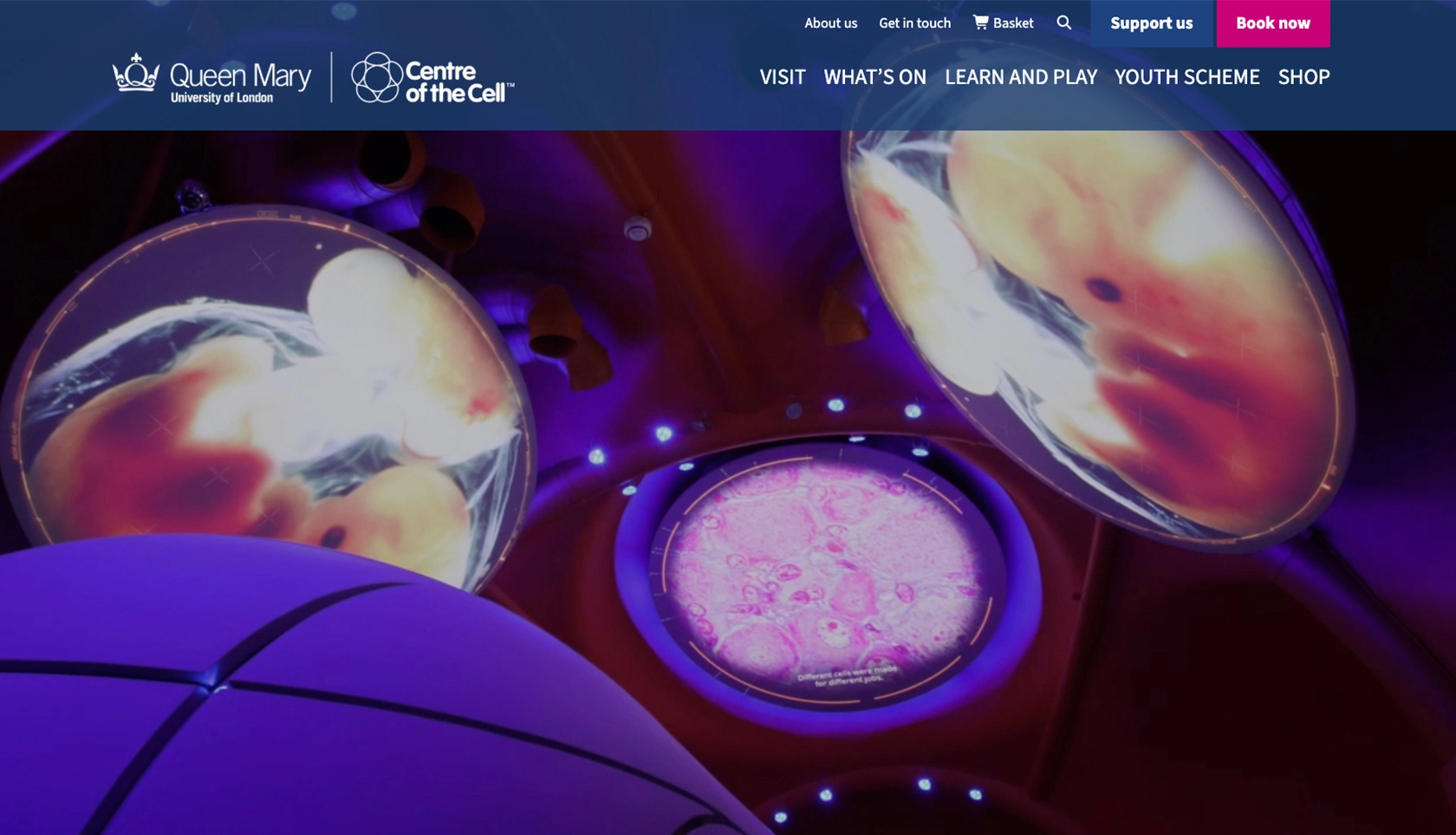
A checkout that couldn't change
The starting point wasn't a blank page. The university already had its own payment system, with a custom WooCommerce integration built around it, and anything the centre sold had to go through it. So the WooCommerce checkout was a fixed point, decided before the project began, and the whole build had to be scoped around using it properly rather than working around it.
Through that one checkout comes a teacher booking a class visit, a family booking a public event, someone hiring the venue, and someone buying a gift from the shop. They want different things, they need to see different information, and they don't all pay the same way.
Two ways to book
A school and a family are not doing the same thing. A family books a public event and pays there and then. A school books a visit for thirty children and needs an invoice, because that is how school budgets work: nobody is putting a class trip on a card at the checkout.
So the two routes separate early and behave differently at the end. I extended the YITH Booking and Appointment plugin with custom functions so that a school booking raises an invoice request to the finance team instead of taking payment, while public bookings carry on through the normal checkout. Same site, same basket, two very different endings.
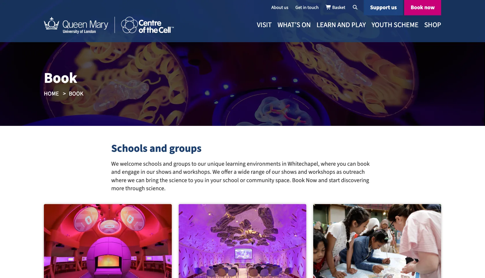
One site, five front doors
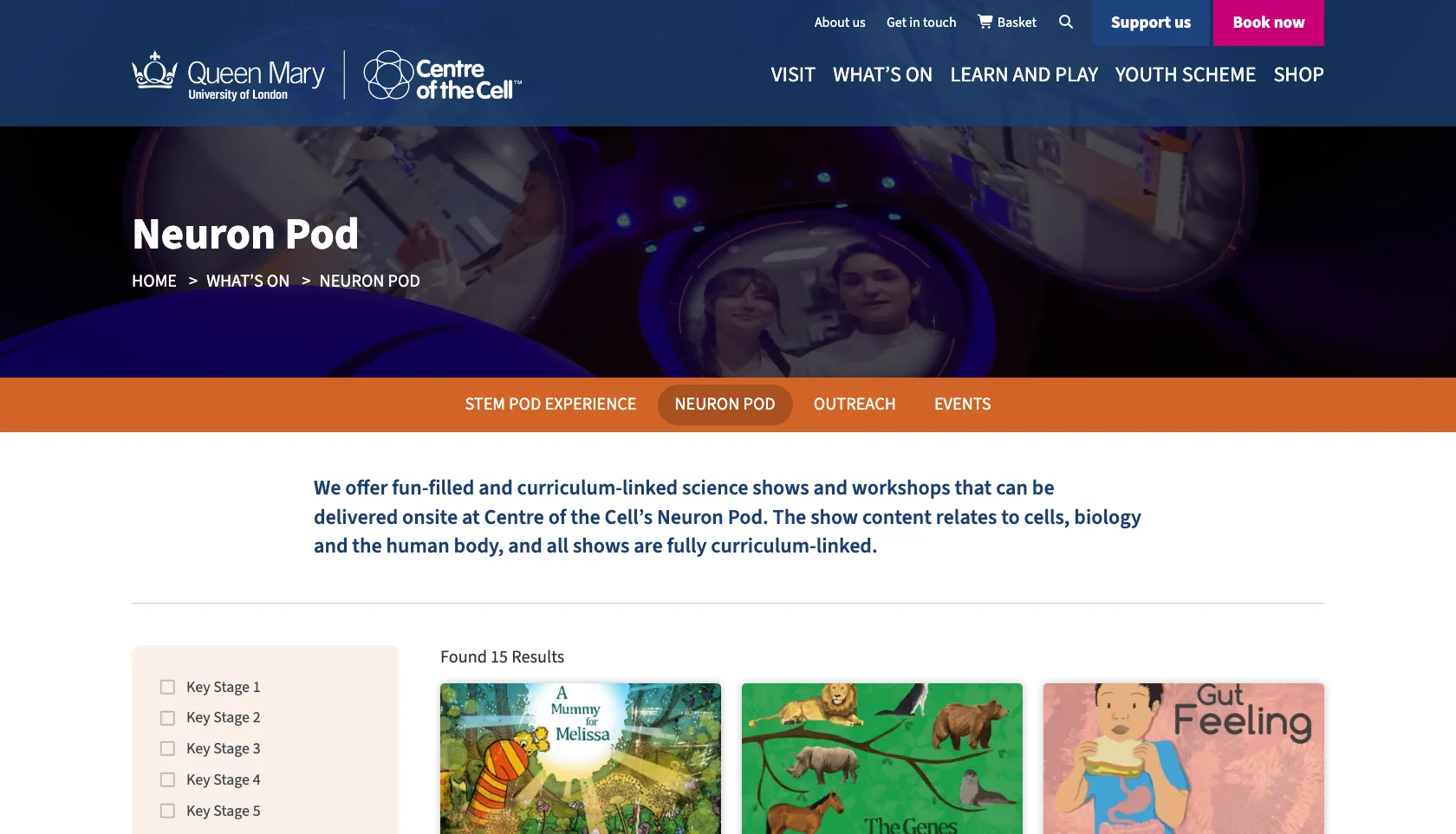
Rather than flatten everything into a single menu, the theme gives each major area its own landing page, its own sub-navigation and its own colour. Visit is purple, What's on is orange, and so on down the site.
It's a small device that does a lot of work. Once you have chosen your route in, the sub-nav keeps only the pages relevant to you in front of you, and the colour tells you at a glance which part of the site you are still in.
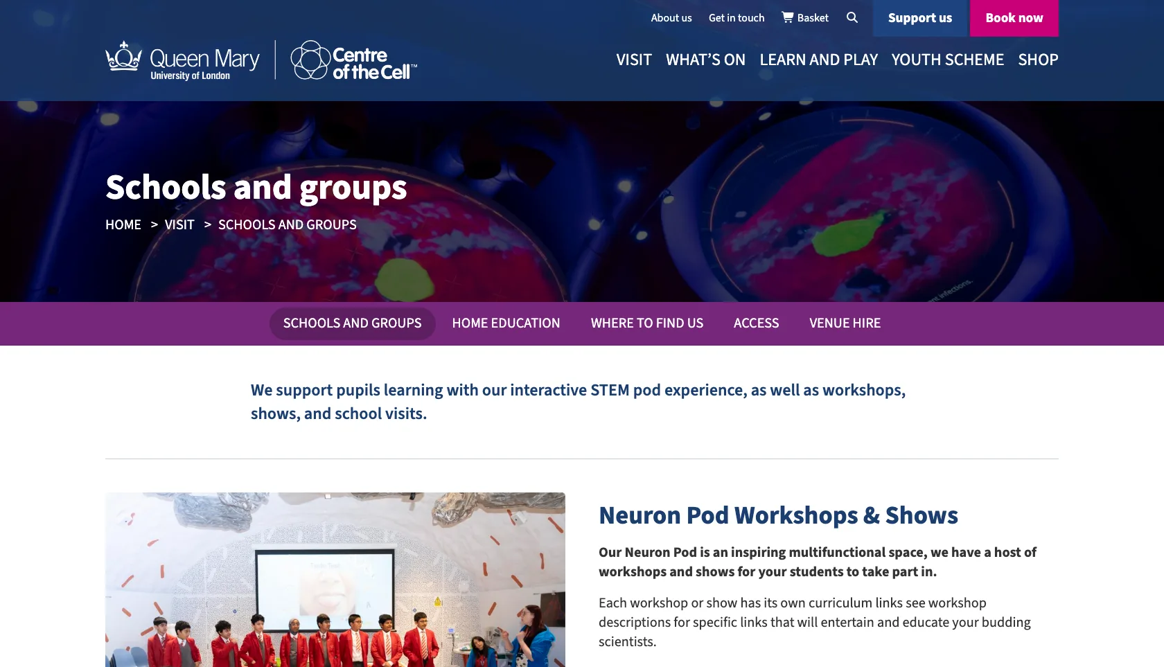
Filtering that matches how teachers think
The Neuron Pod runs fifteen different workshops and shows. A teacher browsing them does not want to read all fifteen: they want the ones that fit their year group and the curriculum they are teaching.
So the listings filter by Key Stage, narrowing down without a page reload and showing a running count of what's left. It turns a long list into a short, relevant one in a couple of clicks.
Behind the scenes
A custom theme rather than a bought one, and a commerce layer shaped by the constraint it had to live inside.
One checkout, several shapes
Because everything routes through the university's payment integration, the checkout itself changes: different templates depending on what's being bought, rather than one generic form asked to cover every case.
Bookings, not just orders
Visits, experiences and venue hire are bookable against real dates and capacity, with custom logic layered on the booking plugin to handle the school and public routes differently.
An admin screen worth having
School bookings vastly outnumber public ones, so I built a custom admin screen that shows public bookings on their own. Staff can see what's coming without wading through everything else to find it.
One site doing four jobs
Centre of the Cell has one site that handles booking, selling, teaching and recruiting, without any of those audiences having to wade through the others to get where they were going. Schools get invoiced the way schools expect to be invoiced, the public pay at the checkout, and the university's payment system sits underneath all of it.
I still look after it: updates, fixes, and new features as the programme changes. That ongoing relationship is the part I'd point to most, because a site like this is never really finished, and it shouldn't need a rebuild every time the offer moves on.
Got a site that has to serve very different people?
If your organisation is trying to be several things to several audiences on one website, that's a structural problem before it's a design one. It's the part I enjoy untangling.